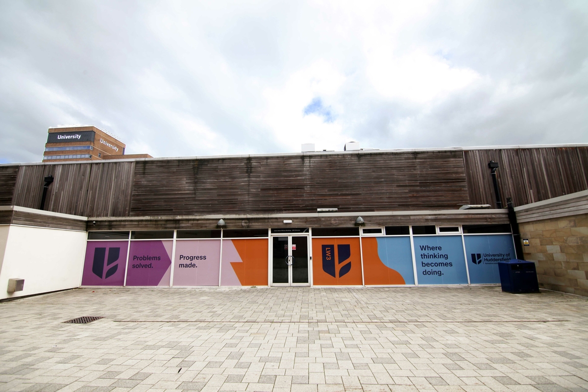
University of Huddersfield: putting humanity at the heart of progress
When we joined the University of Huddersfield team to develop their new brand, they had already established a clear strategic direction, developed by PS London alongside the University. Our role was to take that thinking forward, using engagement, creative exploration, design and copywriting to translate the strategy into a distinctive, flexible brand.
The ambition was clear: create a brand that feels authentically Huddersfield, which would improve not only awareness of Huddersfield offer, but which would also help stakeholders understand exactly what the university stands for, believes in and can offer to the world.
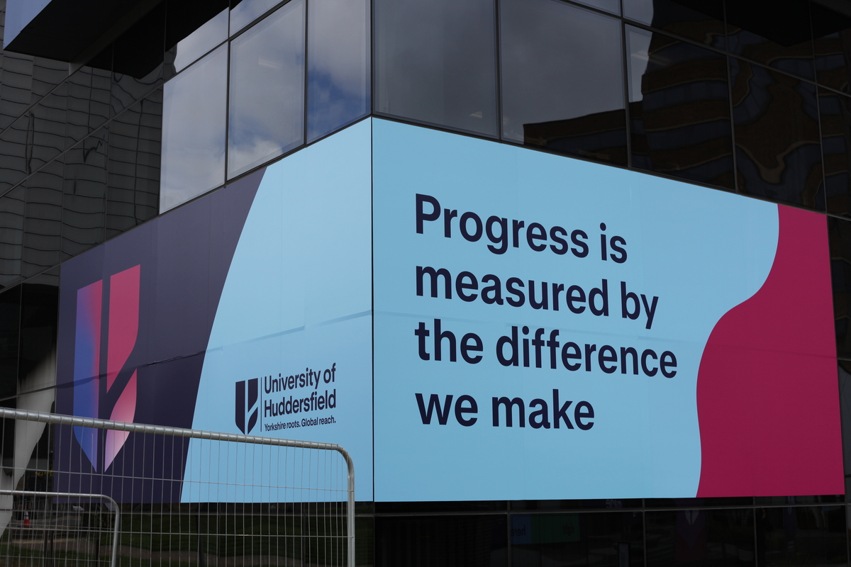
Ultimately, the new brand had to deliver on the promise of Huddersfield's brand belief; progress matters most when it improves lives.
Listening first
Before we started creating, we listened.
Around 900 people took part in the engagement process, giving us a rich picture of how the University is experienced by its students, staff, prospective students and wider community.
900 people engaged
50+ hours of discussion
769 survey responses
Working groups across the University
2 Critical Friend Groups
2 Prospective Student Groups

A visual identity rooted in place
Working from the strategy and engagement already developed with the University, our challenge was to turn those ideas into a visual identity that felt unmistakably Huddersfield – confident, human and flexible enough to work across the whole University.
One University colleague gave us a challenge that really stuck:
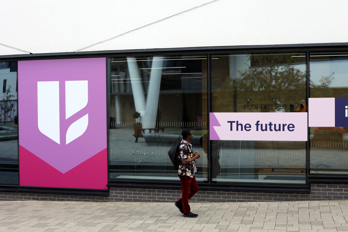
“Be as striking and bold as the architecture on campus – those decision choices were bold and brave – let’s make sure the brand is as well.”
The University already has a strong visual character in its buildings and surroundings. We wanted the brand to live up to that, without becoming overly designed or complicated.
Confidence through simplicity
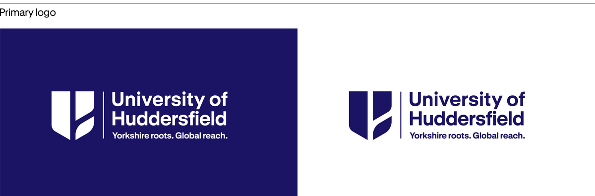
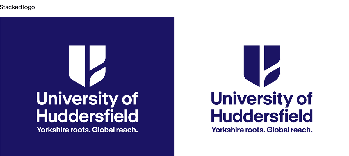
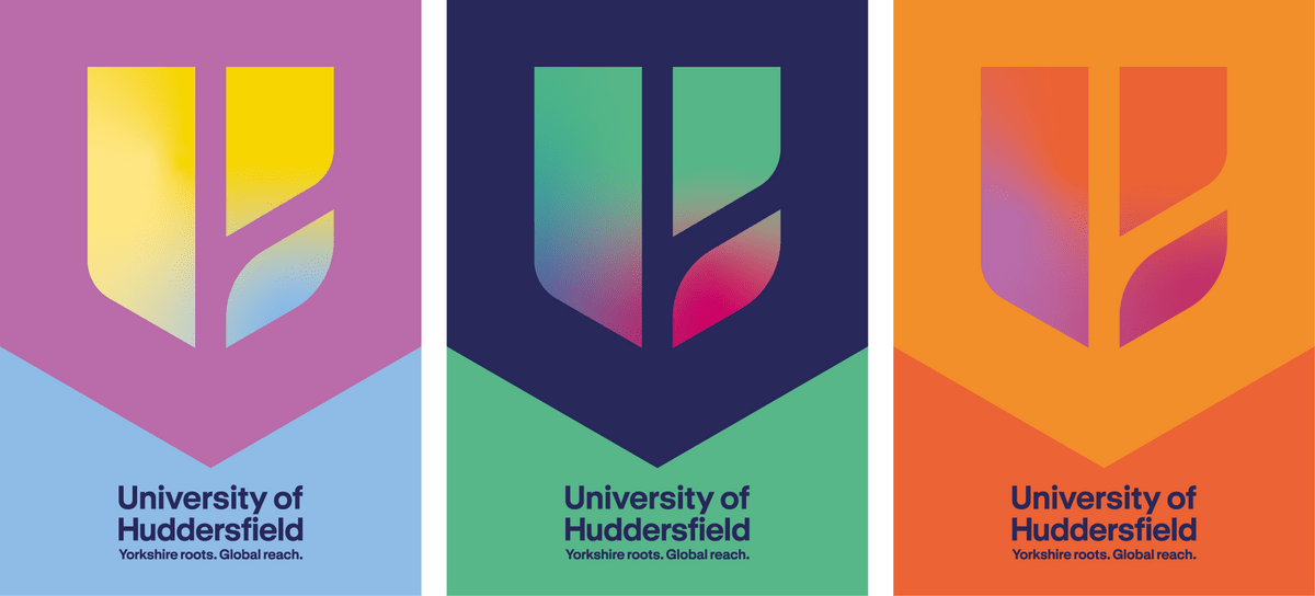
At the heart of the identity is a simple, contemporary motif.
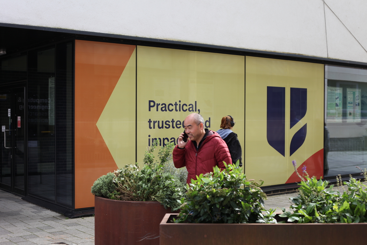
It reinterprets the authority of a traditional shield in a cleaner, more forward-looking form. At its centre, the negative space creates a subtle H while echoing the canal running through campus – a quiet reference to place and connection.


The three surrounding forms of the motif represent staff, students and the University’s commitment to sustainability – the people and values at its heart. Their organic qualities also allow other interpretations, from leaves and trees to more abstract natural forms.
The simplicity of the motif is deliberate. It gives the University a confident foundation, while allowing it to work as a logo or as a graphic element in its own right.
Finding the words to match the identity
A visual identity is only half the story. The University needed language that felt unmistakably Huddersfield – confident, human, and flexible enough to work across every corner of the institution.
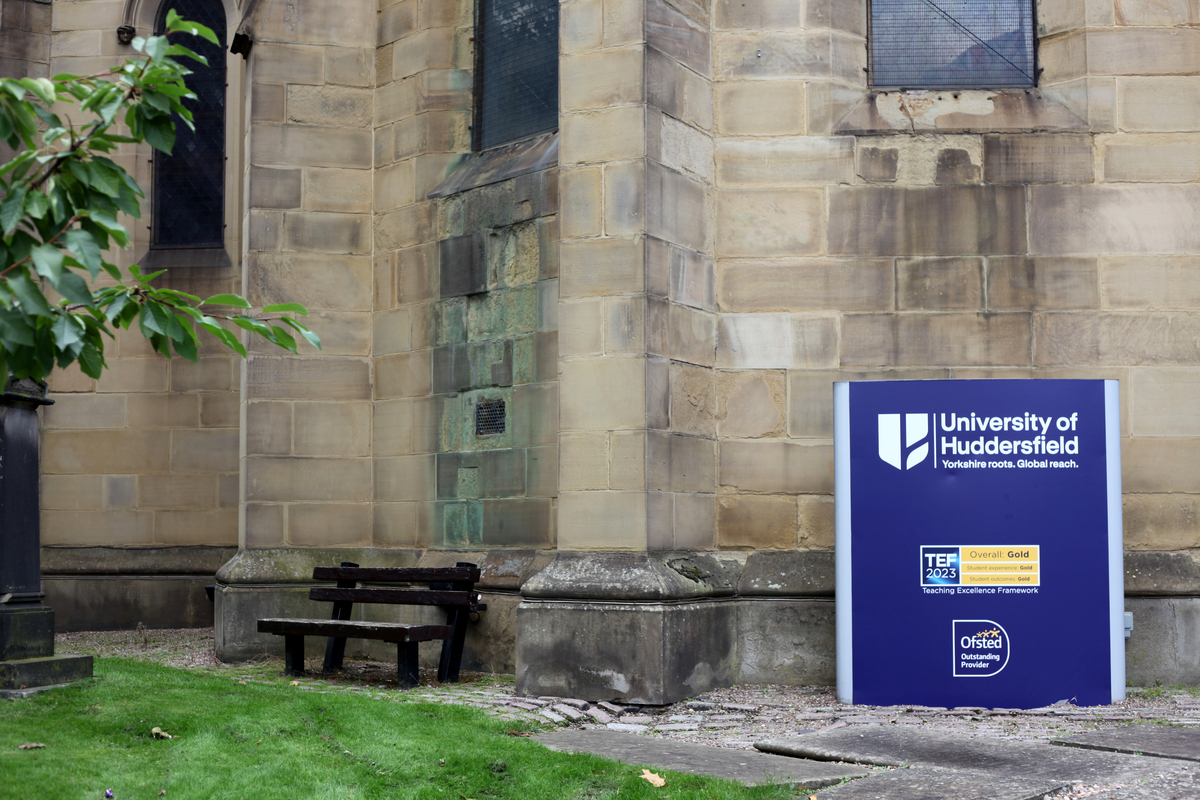
We started with the strapline: Yorkshire roots. Global reach. It both grounds the University in a real, specific place, while signalling the ambition and outcomes that place makes possible. It became the thread running through everything else – a brand that's proud of where it's from, without ever being limited by it.
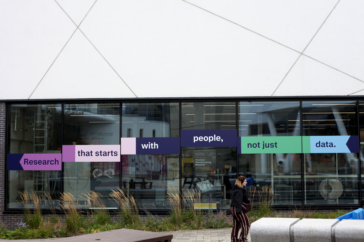
From there, we developed a tone of voice. Huddersfield needed to sound straight-talking, clear and direct – no jargon, nothing that felt like it was written by committee – and always with its Yorkshire identity (although it never strays into cliché). Alongside that sits warm and welcoming, and a quiet confidence – a university that doesn't need to shout to be taken seriously, the substance is already there.
That tone shaped the brand narrative. Rather than a single strapline doing all the work, the narrative gives the brand belief room to be explained in full – progress matters most when it improves lives, brought to life through the people who make that a reality. From the students supported to find their own path, staff genuinely invested in their success, and research and partnerships that reach 'far beyond our town'.
Together, the strapline, tone of voice and narrative gave every part of the University – from prospectuses to campus signage to recruitment campaigns – a shared, recognisable voice to build from.
Shapes of Place
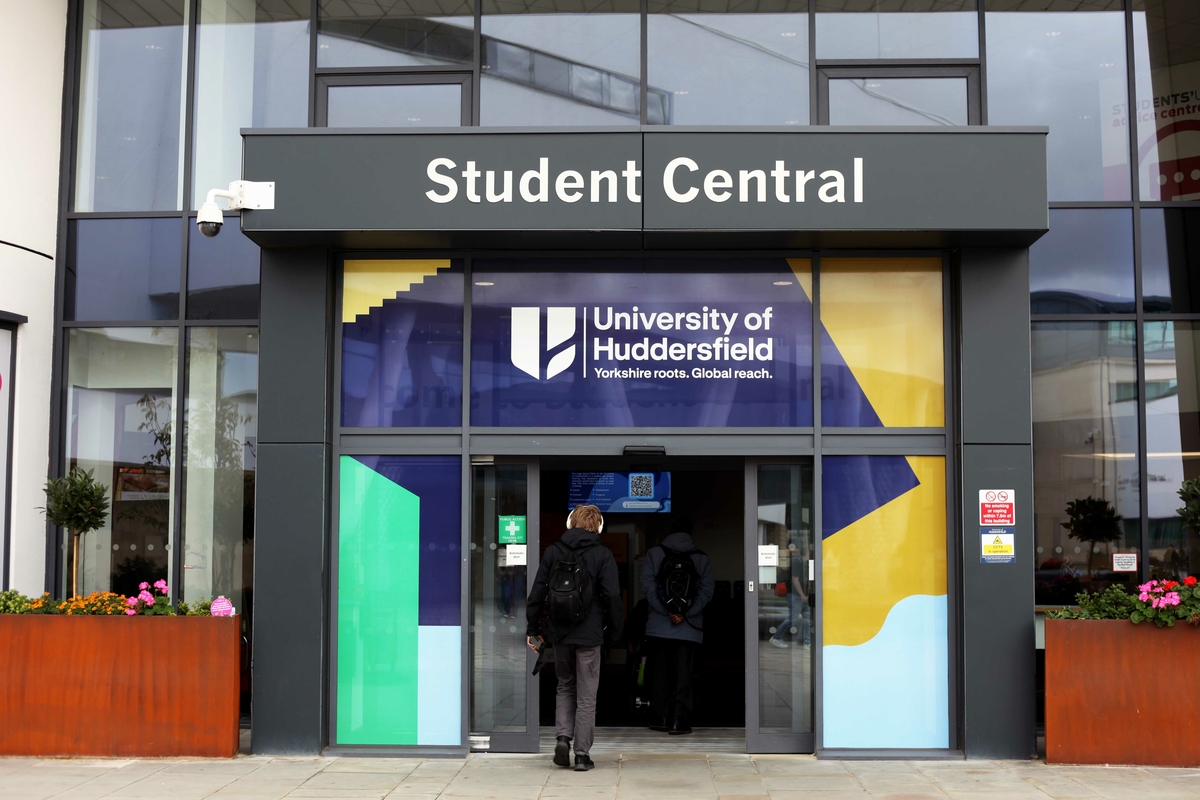
One of the biggest challenges was creating a brand that could work across the whole University. We knew the graphic language would do much of that heavy lifting.
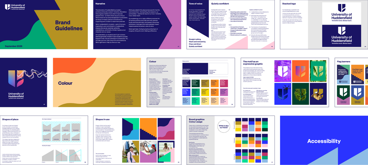
We created Shapes of Place – a visual language drawn from Huddersfield itself. The canal, distinctive campus architecture, layered and stepped campus, Yorkshire landscape, heritage buildings and modernist forms all became sources for the system.

Huddersfield has a particularly distinctive visual character – the way the campus rises and falls, the canal running through its centre, the mix of old and new architecture, and the surrounding green landscape. These became a rich source of inspiration without needing to be represented literally.
The shapes can be quiet and restrained or bold and expressive, depending on the story being told. They can frame photography, create compositions or become patterns and textures.
The result is a flexible system that allows different parts of the University to express themselves while remaining recognisably part of the same institution.
Colour
The colour palette takes its cues from the same sense of place. The blues and greens of the campus, Yorkshire sandstone and the heather of the surrounding moors all informed the palette.
Blue and white remain the foundation, retaining the recognition and equity of the existing brand. The original blue has been evolved into a warmer, richer shade, while supporting colours bring additional energy and flexibility.


Clear, accessible and considered
GT Standard was chosen for its simple, geometric character, echoing the wider graphic language. Its distinctive letterforms also support legibility and accessibility.
Accessibility has been a consideration throughout the identity, not an afterthought. From typography and colour contrast to layouts and the brand guidelines themselves, we’ve designed the system and its outputs to be as clear, legible and usable as possible.