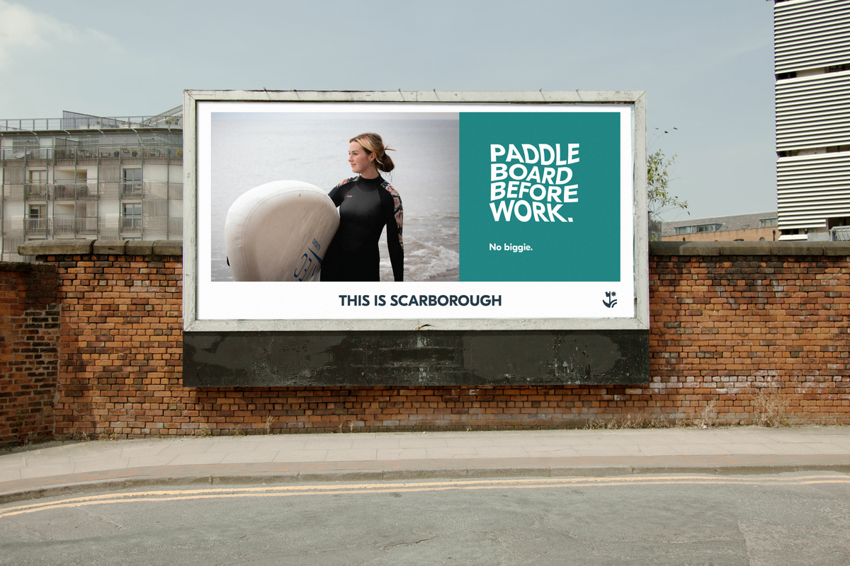
This is Scarborough
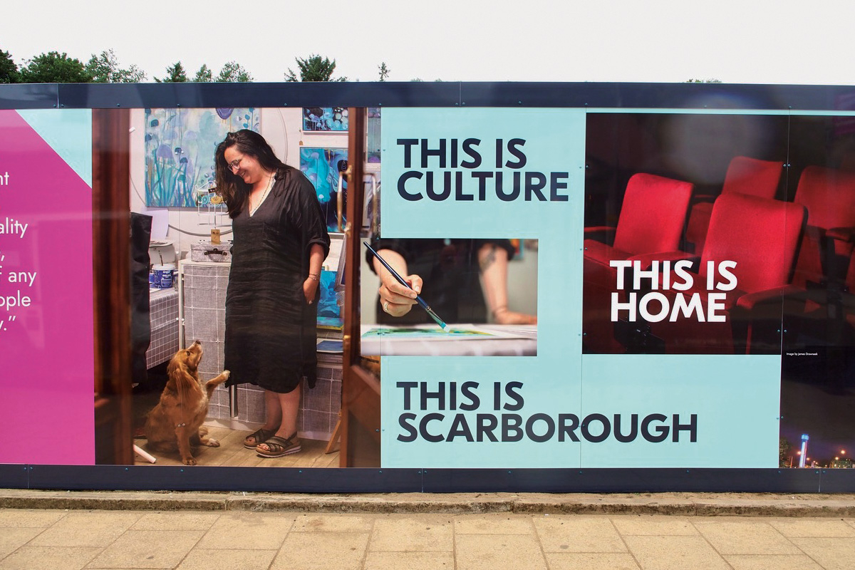
We were commissioned by Scarborough Council to create a narrative and brand to share the magic of the Town with the wider world. Designed to unlock civic pride, generate investment, encourage relocations and of course, to make people want to visit the wonderful Town as soon as they possibly can. The brand is there to be used, by Scarborough Council but also its partners, in their everyday missions to make this great town by the sea even better.
The logo took inspiration from the Town's orginal 13th Century Seal. Featuring an anchor, castle and star motif. It has been designed to reflect the rich heritage and landscape of the town, whilst telling the story (through the symbolism of the anchor) of a place you can put down roots. Scarborough is a town that faces forward, too, so the star is guiding you to the future.


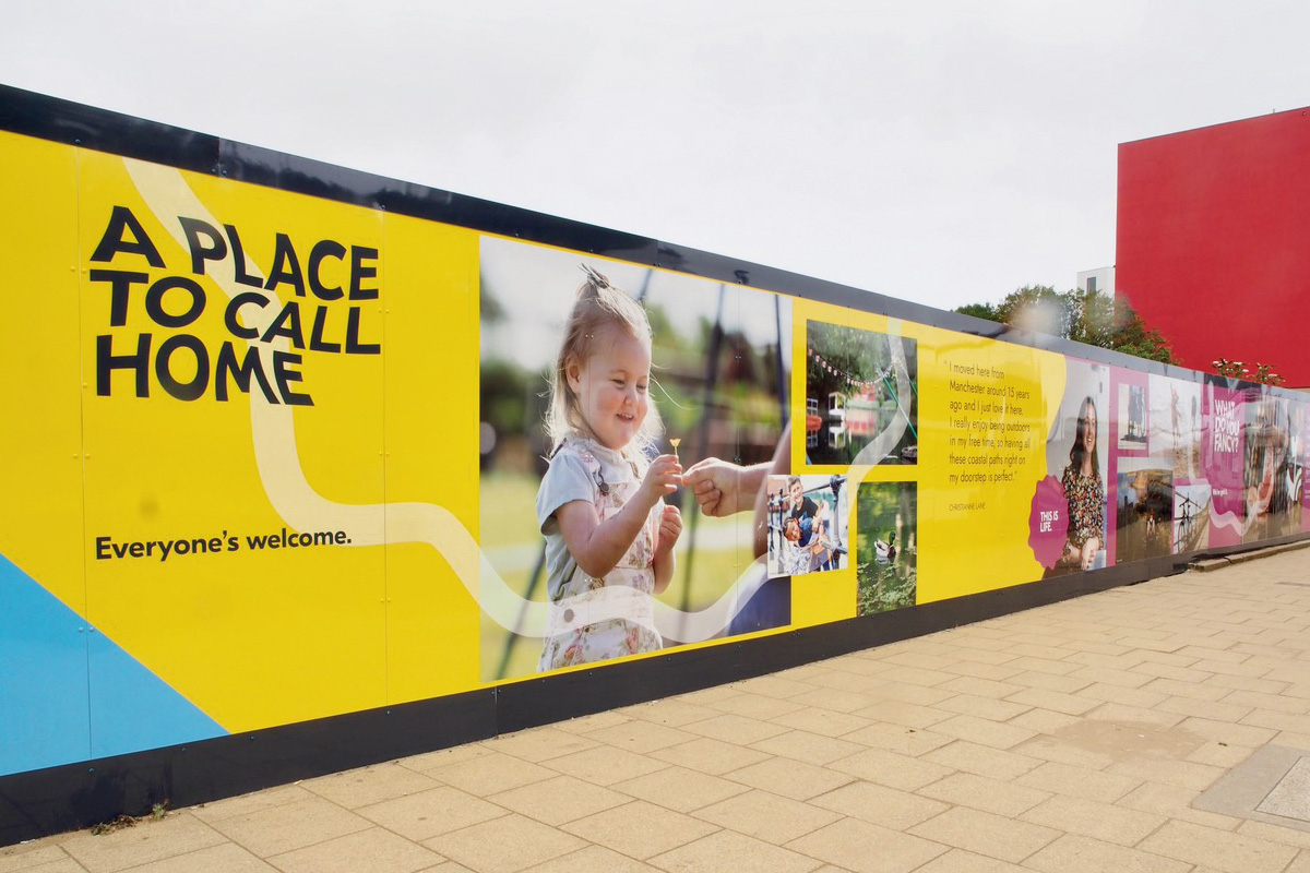
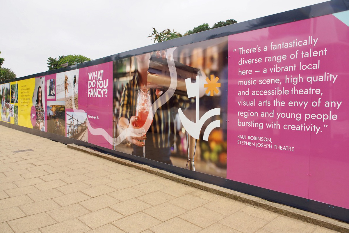
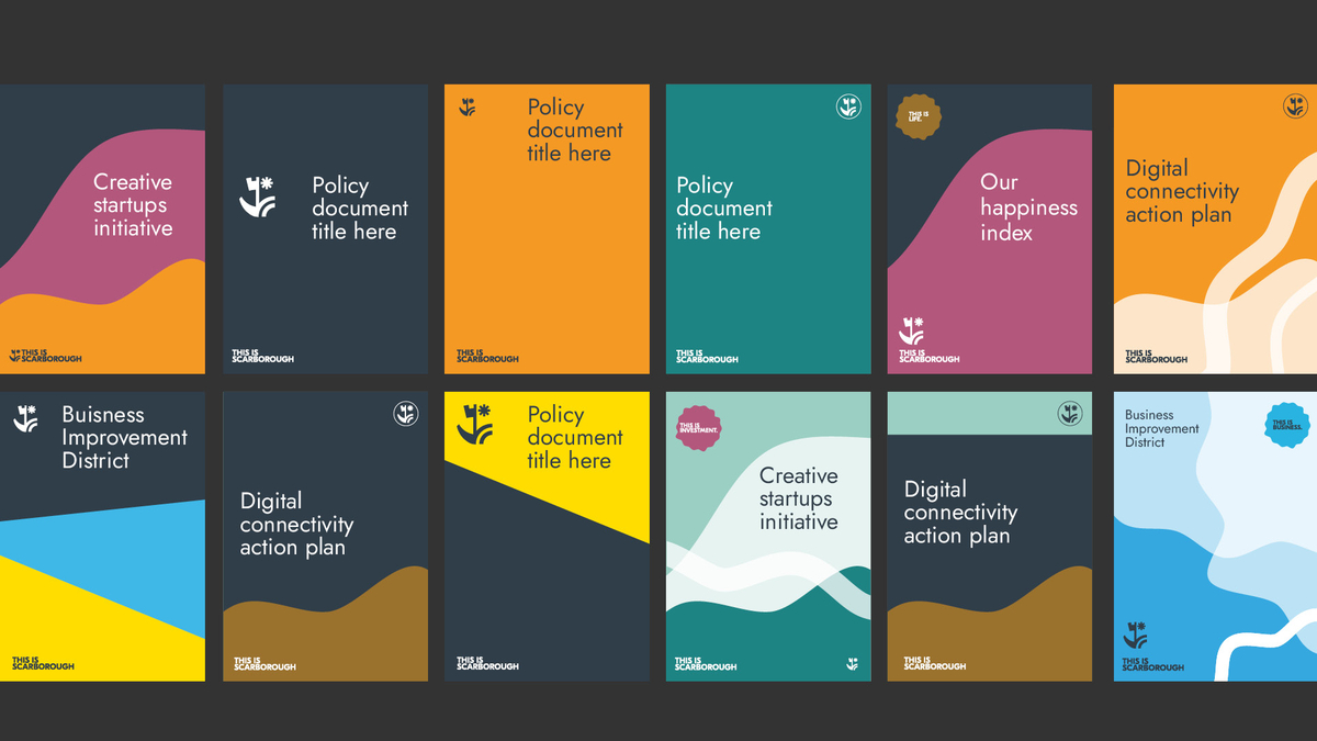
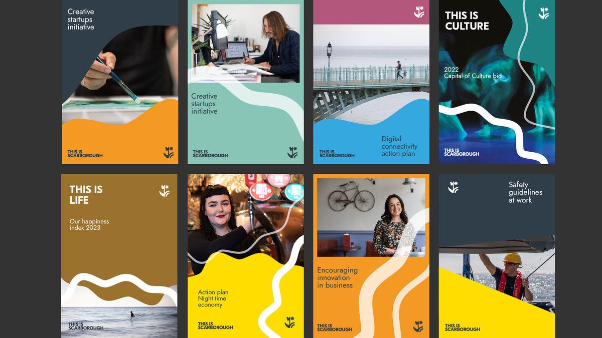
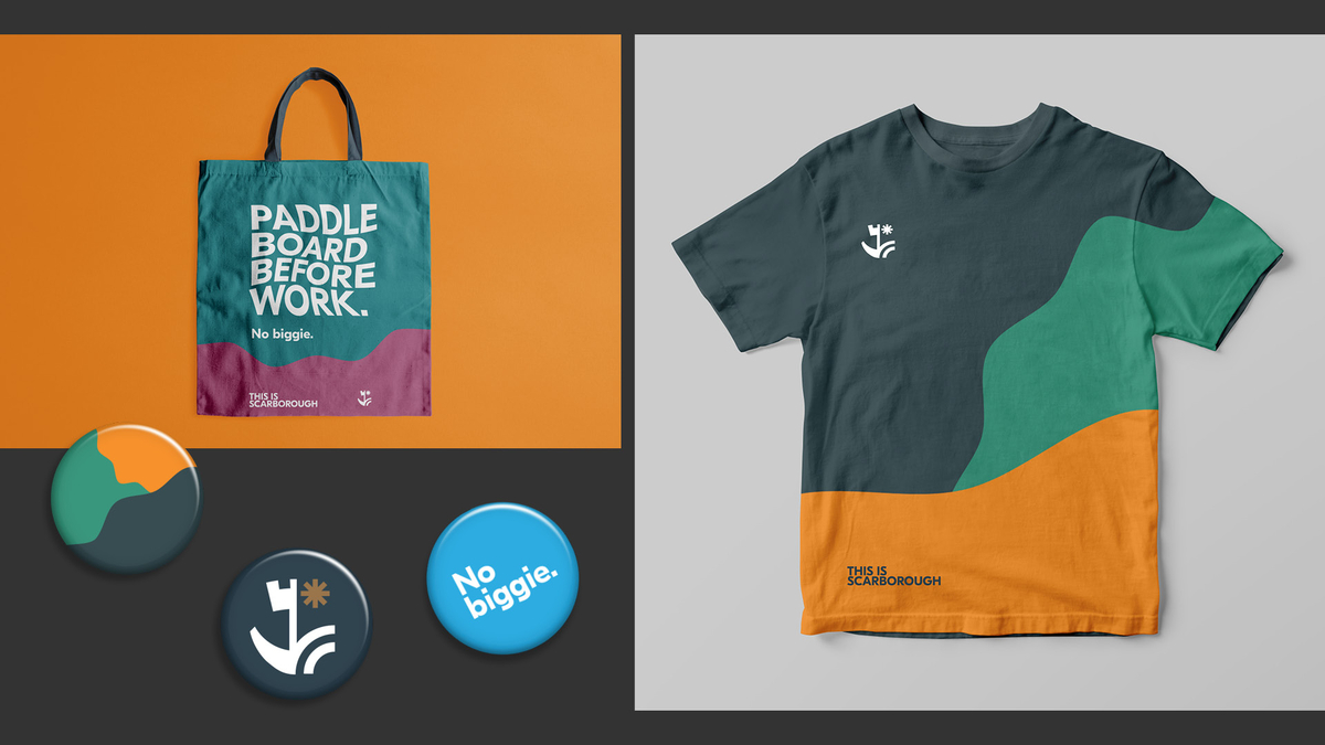
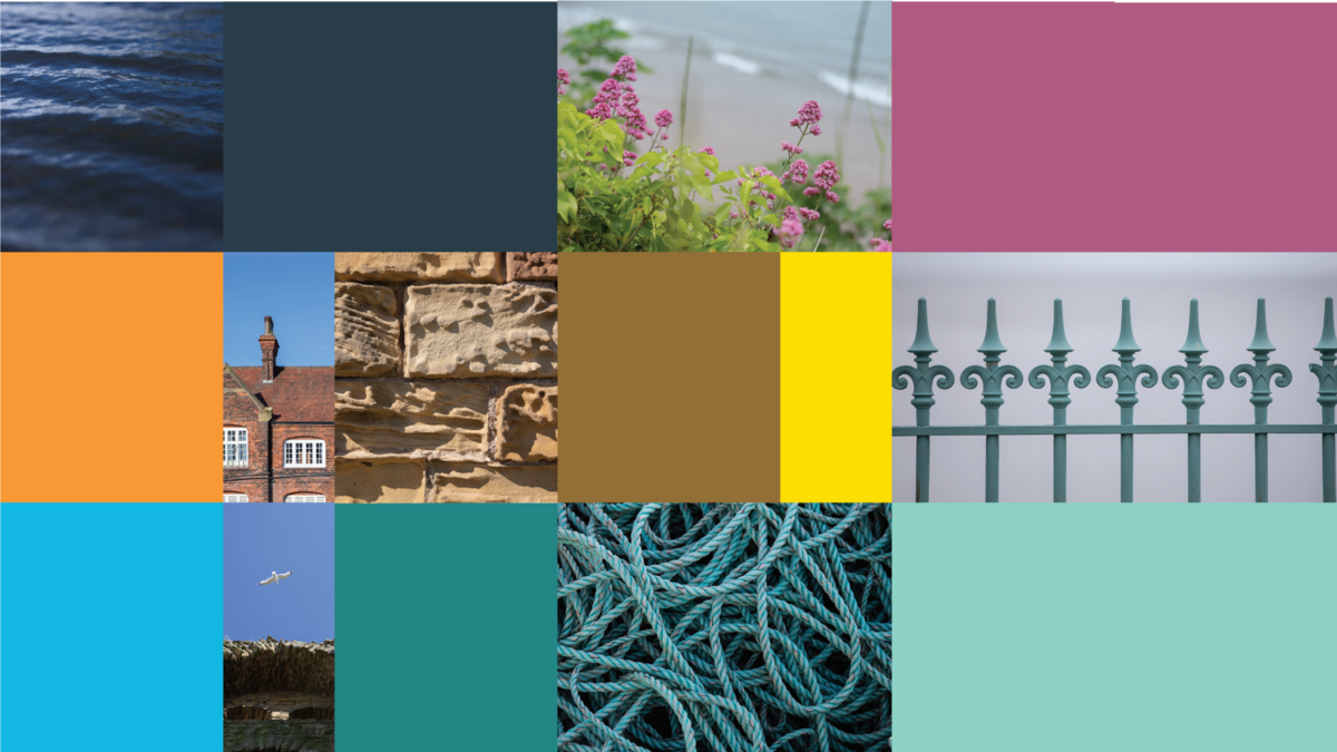
With a colour palette inspired by the town itself, the brand colours are designed to be used as solid backgrounds to add a really distinct feel to Scarborough’s communications.
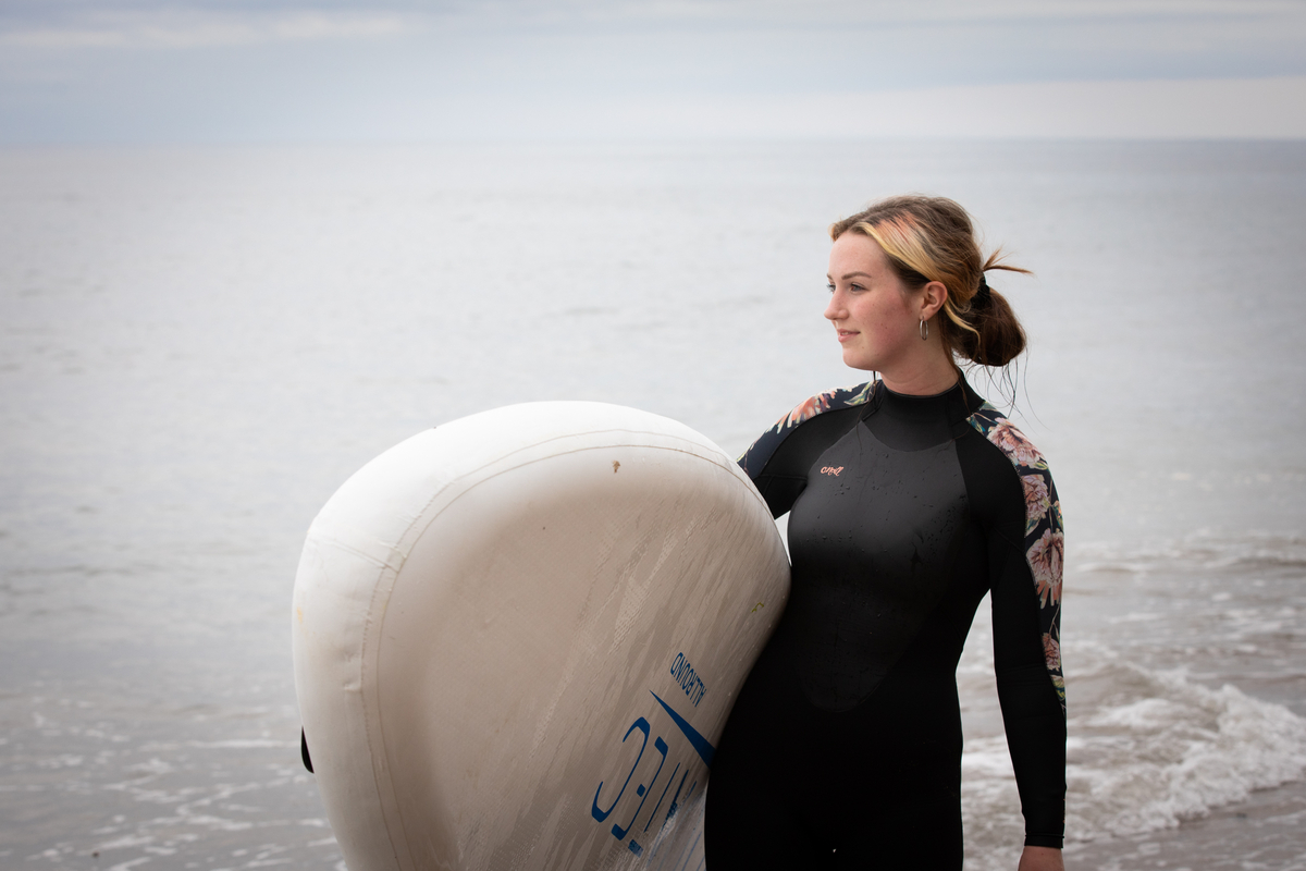
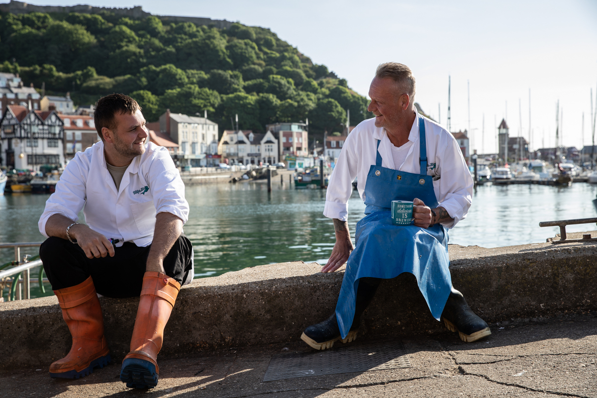
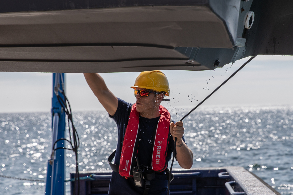
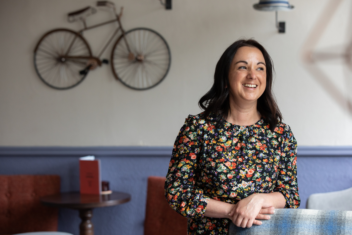
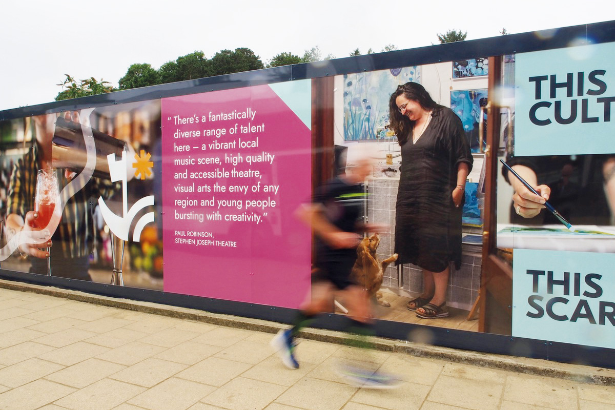
Scarborians and their personal stories are the key to positioning Scarborough not only as a place to visit but also as a place to put down roots. We commissioned photographer Bec Hughes to help us capture these stories through shots of people, place and texture.